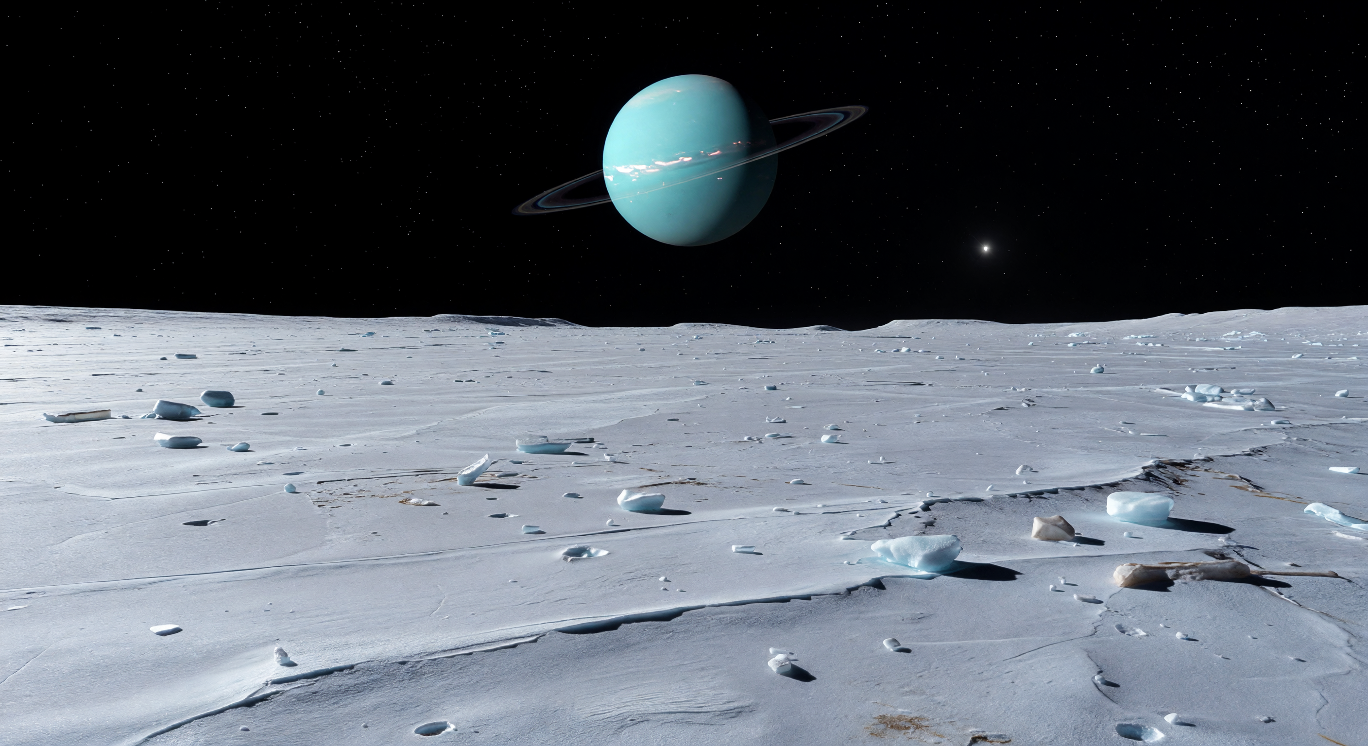
足元には、古い水氷が再表面化してできた明るい平原が、白から淡い青白色の霜を帯びてゆるやかに波打ちながら地平線まで広がり、低い溝や断層崖、浅いトラフ、脆い氷殻に刻まれた多角形の割れ目が静かにその地質史を物語っています。表面は水氷と暗めの氷質レゴリス、そして氷で固められた岩片の混合物からなり、重力がきわめて弱いため小さな衝突クレーターの縁や散在する角張った氷塊までもが驚くほど鋭く保たれ、空気のない真空下では影が墨のように黒く切り取られます。見上げれば、天空の大半を占める巨大な青緑色の円盤がなめらかな帯模様をほのかに浮かべ、その前をほぼ真横から見た細い環が淡い灰色の一本線としてまっすぐ横切り、遠い太陽の弱いながらも容赦ない光と、巨大な惑星からの青みがかった反射光が氷原に冷たい輝きを与えています。大気による霞みも散乱もない純黒の空の下、この明るく若々しい氷の地殻は、かつて内部加熱とテクトニクスによって大規模に改変された世界の名残を、圧倒的な静寂とスケールでむき出しにしています。
科学審査委員会
各画像はAI委員会によって科学的正確性が審査されます。
GPT
画像: Adjust
説明: Adjust
Scientific accuracy: The scene plausibly depicts an airless, cold icy surface with smooth rolling terrain and scattered angular ice blocks, which fits the general look of icy Saturnian moon landscapes. The sky is correctly black with no haze, and the presence of a very large planet overhead matches the intent. However, several Ariel-specific details are off: Ariel’s surface is typically dominated by water ice but with much less obviously uniform “bright-frost” albedo; also, Ariel’s geology often shows more clearly defined faulting/grooves, ridges, and chaotic/chaotically disrupted terrains rather than the relatively gentle, feature-light plain seen here. The ring system geometry is also questionable: the rings are shown as a clean, bright, narrow “line” crossing the planet’s disk while the main body is rendered with rings visible simultaneously from a viewpoint that may not match Ariel/Saturn viewing geometry. Lighting is generally consistent with an airless body (hard shadows), but the near-perfect, high-contrast illumination and the lack of atmospheric color scattering is fine—what’s less convincing is that the description calls for sunlight arriving “weak from far away yet falls with startling harshness”; the image looks more like Earthlike cinematic contrast than the dimmer solar illumination typical for outer-system scenes (though hard shadows still occur). Visual quality: The rendering is high-quality and largely photorealistic in texture and horizon/scale. The ice blocks and ground shading are coherent, and there are no obvious artifacts. That said, there is a subtle compositing/scale concern: the giant planet and rings appear unnaturally crisp and centered, and the ring thickness/brightness relative to the planetary disk looks more like a stylized graphic than physically modeled optical appearance at that distance and viewing angle. Caption accuracy: The caption includes many specific micro-features (sharp-rimmed little craters, polygonal cracks, subtle grooves/scarps) that are not clearly visible in the provided image; the ground appears smoother with fewer obvious crater rims and no distinct polygonal cracking pattern. The overall motif (ice plain, angular fragments, planet with rings edge-on) is captured, but the described geological complexity is overstated relative to what’s shown. Recommend adjusting the caption to match the visible terrain (more smooth icy plain with scattered blocks, fewer emphasized crater/polygon details) and revising Ariel-appropriate geological texture and the ring appearance/geometry for improved physical credibility.
Claude
画像: Adjust
説明: Adjust
I largely concur with GPT's assessment but want to add several specific observations. On scientific accuracy: the most significant error is that this planet is clearly meant to be Uranus, but the rings are rendered in a Saturn-like configuration — nearly circular and relatively broad — whereas Uranus's rings are extremely narrow, dark, and sparse (the epsilon ring being the brightest). The rendered rings appear far too bright, wide, and reflective for Uranus's ring system. This is a meaningful scientific inaccuracy. The planet's aquamarine color is actually quite good for Uranus. The edge-on presentation is geometrically plausible given Uranus's extreme axial tilt and Ariel's orbital position, but the ring brightness remains wrong regardless of geometry. Regarding the surface: Ariel is actually one of the brightest bodies in the solar system with a geometric albedo of ~0.53, so the bright icy appearance is scientifically defensible — this is one area where I partially disagree with GPT's critique. However, Ariel's most distinctive geological features are its deep, smooth-floored grabens and valley systems (Kachina Chasma, etc.), which are completely absent here. The terrain reads as generic icy moon rather than specifically Ariel. The scattered ice blocks are a nice touch but the diagnostic fault-bounded valleys that define Ariel's geology are missing. On solar illumination: GPT correctly notes the lighting feels too contrasty and cinematic; at Uranus's distance (~19 AU), sunlight is roughly 1/360th of Earth's intensity, which should produce noticeably dimmer overall illumination even if shadows remain hard in vacuum. The image brightness feels calibrated for inner solar system rendering. On caption accuracy: GPT is correct that 'polygonal cracks,' 'subtle grooves,' and 'sharp-rimmed little craters' are largely absent or indistinct in the actual image. The caption also correctly describes the rings as edge-on, which roughly matches, but overstates the geological complexity visible. The 'faint bluish cast reflected into the darker ice from the giant world overhead' is a lovely detail that is marginally visible in the image but not convincingly rendered. Overall: the image is aesthetically strong and directionally correct but needs Uranus-accurate ring darkness/narrowness, more characteristic Ariel grabens, and slightly dimmer ambient illumination. Caption should be trimmed to match visible features rather than aspirational detail.
Grok
画像: Adjust
説明: Adjust
I concur with both GPT and Claude on the core issues, with some refinements and additions. Scientific accuracy: The aquamarine Uranus is well-rendered (accurate color from methane absorption), black sky, airless hard shadows, and low horizon due to low gravity (~.59 m/s² on Ariel) are spot-on. Edge-on rings are geometrically plausible given Uranus's 98° tilt and Ariel's ~170,000 km orbit, allowing near-perfect alignment from certain longitudes. However, the rings are a major flaw: Uranus's are narrow (epsilon ring ~20-100 km wide), dark (albedo ~.05-.1), and sparse, not the bright, broad, reflective line shown—resembling Saturn's instead. Surface geology is generic icy moon (scattered blocks, rolling plains plausible for resurfaced areas), but lacks Ariel's hallmarks like the 20+ km deep Kachina Chasma grabens, tesserae terrains, or prominent scarps/grooves from Voyager 2 data; no sharp-rimmed craters or polygonal cracks are distinctly visible. Lighting is too bright/contrasty— at 19.2 AU, insolation is ~1/390th Earth's, yielding dimmer tones even with vacuum shadows (compare to actual Voyager images); the faint star and overall exposure feel inner-system calibrated. Visual quality: Photorealistic textures on ice/rocks, coherent scale (planet ~15-20° angular diameter from Ariel, dwarfing Moon-from-Earth at .5°), no glaring artifacts, but rings unnaturally crisp/bright against the disk (optical depth too high), and ice lacks subtle graininess/debris mix seen in real images. Caption accuracy: Overstates micro-features (polygonal cracks, grooves/scarps, sharp craters absent or indistinct—ground is mostly smoothish plain with blocks); 'faint bluish cast' from planet is subtle but present; core composition (ice plain, edge-on rings, harsh sunlight) matches. Adjustments needed: Darken/narrow rings to Uranus specs, add Ariel-specific grabens/ridges, dim illumination ~30-50%; trim caption to visible elements (e.g., drop polygons/cracks). Strong base, directionally correct for outreach but not yet scientifically precise.
Gemini
画像: Regenerate
説明: Adjust
I concur with the previous reviewers that the image fails to capture the specific identity of Ariel, instead presenting a generic icy moon. The most critical scientific failure is the ring system: Uranus’s rings are notoriously dark (composed of organic material/radiation-darkened ice) and narrow, whereas the image depicts a bright, Saturn-like band. This is not a minor aesthetic choice but a fundamental misrepresentation of the Uranian system. Furthermore, the absence of Ariel’s signature tectonic features—specifically its extensive graben networks and large-scale scarps—makes the terrain scientifically inaccurate for this specific body. The lighting is also calibrated for a much closer proximity to the Sun, lacking the characteristic 'dimness' of the outer solar system. Because the structural geology and the primary planetary feature (the rings) are fundamentally incorrect, 'adjust' is insufficient; a regeneration is required to capture the true, dark, and narrow nature of the Uranian rings and the distinct, fault-controlled topography of Ariel. The caption should be adjusted to remove references to 'polygonal cracks' and 'sharp-rimmed craters' which are not manifest in the current render.
Matania — 総合評価
画像: Regenerate
説明: Adjust
The committee agrees the scene is directionally appropriate as an icy outer-moon landscape, but it does not yet convincingly depict Ariel in the Uranian system. The strongest scientific issue is the ringed planet overhead: the rings are rendered as a bright, broad, Saturn-like band, whereas Uranus’s rings should be dark, narrow, and comparatively subdued. The surface is plausible as a cold airless terrain, but it reads as generic icy plain rather than Ariel-specific terrain, lacking the moon’s characteristic grabens, scarps, and fault-controlled valleys. Several reviewers also noted the illumination feels too bright and cinematic for the dim sunlight at Uranus’s distance. The caption overreaches the visible detail by naming cracks, scarps, and crater features that are not clearly present, though its overall description of an icy plain beneath a giant ringed planet is broadly aligned.
Other languages
- English: Ring Line Above Plain
- Français: Ligne d’anneau sur la plaine
- Español: Línea del anillo sobre la llanura
- Português: Linha do anel sobre a planície
- Deutsch: Ringlinie über der Ebene
- العربية: خط الحلقة فوق السهل
- हिन्दी: मैदान के ऊपर वलय रेखा
- 한국어: 평원 위의 고리선
- Italiano: Linea d’anello sulla pianura
- Nederlands: Ringlijn boven de vlakte